COMMONWEALTH TRAILER PARTS: The parts to keep you moving.
Web Design, Logo & Brand Identity
My Role:
Web & Graphic Designer
Developer:
Kyle Musco
Other Credits:
Photos taken by Commonwealth Trailer Parts employees
Commonwealth Trailer Parts came to me looking for a brand identity design that would match their growth and competitiveness in the South Central Pennsylvania and Northwestern Maryland market. I was inspired by their enthusiasm in wanting to stand out from their competitors by using bright colors. A significant component of the Commonwealth brand is to expand upon their dedication to great customer service and competitive pricing.


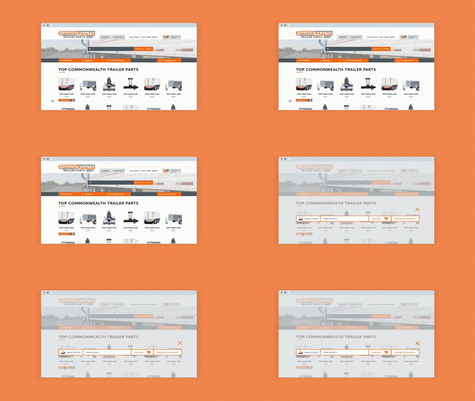
The website’s primary target audience is any customer who want to purchase trailer parts. So, the home page design features all of the trailer parts that can be categorized by part type, brand and distributor. It’s also possible to search the exact part. I also designed a new About section, a Part Detail section, and a shopping cart.


“I think the website is looking great and I like the changes we made since wireframes. Everything has a nice clean feel. Thank you for all your hard work.”
-Chad, Commonwealth Trailer Parts


I approached the logo design with the “the parts to keep you moving” concept. I was inspired by all of the different features of an 18 wheeler and wanted to incorporate it into the logo design in some way. That type of idea is always a part of my logo design process. I tested out simple illustrations of the side, front and back of an 18 wheeler. In the final logo design, the parts of the logo make up an 18 wheeler, which in turn keep the logo together, just like the tagline of the brand says.


