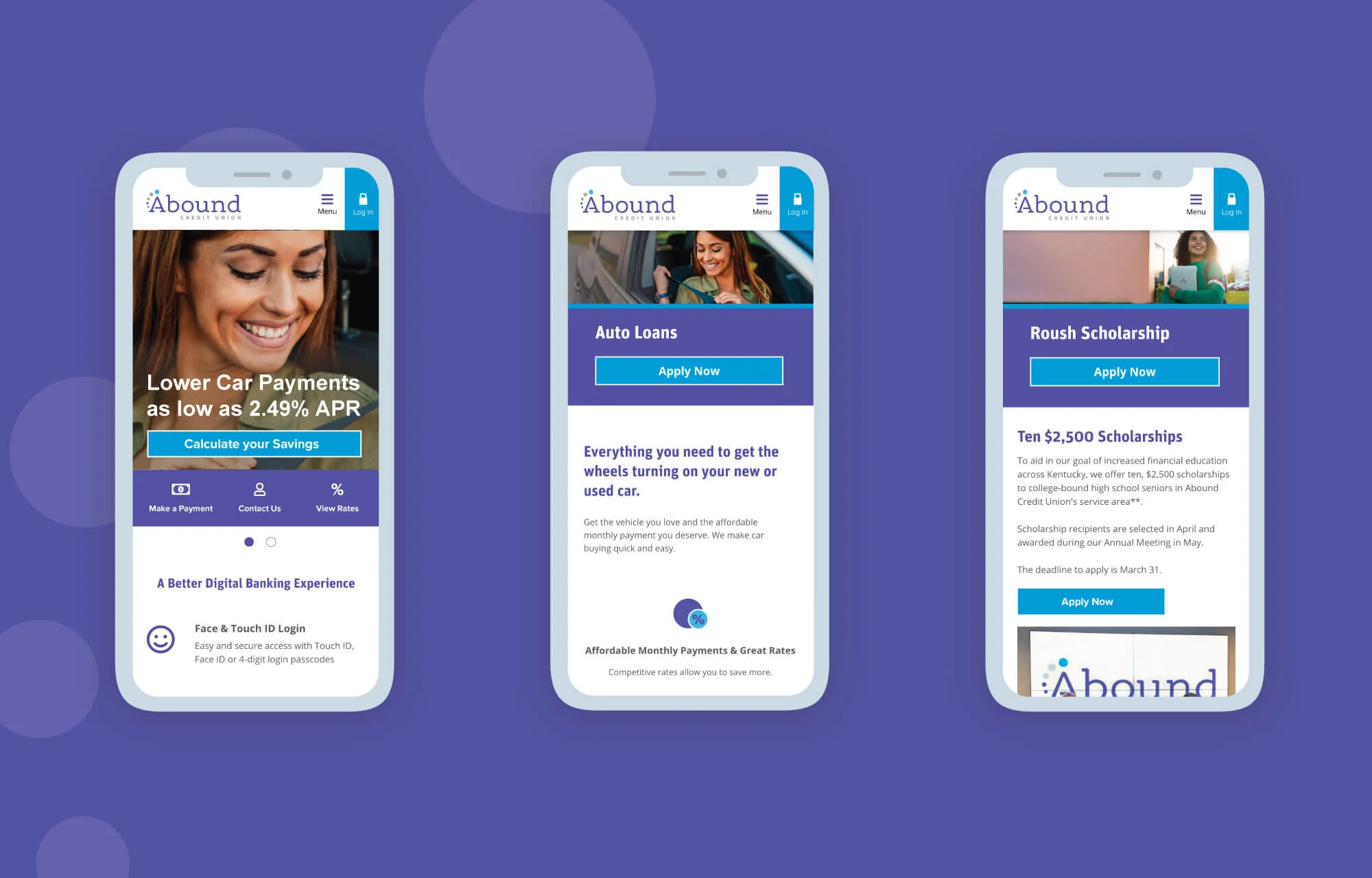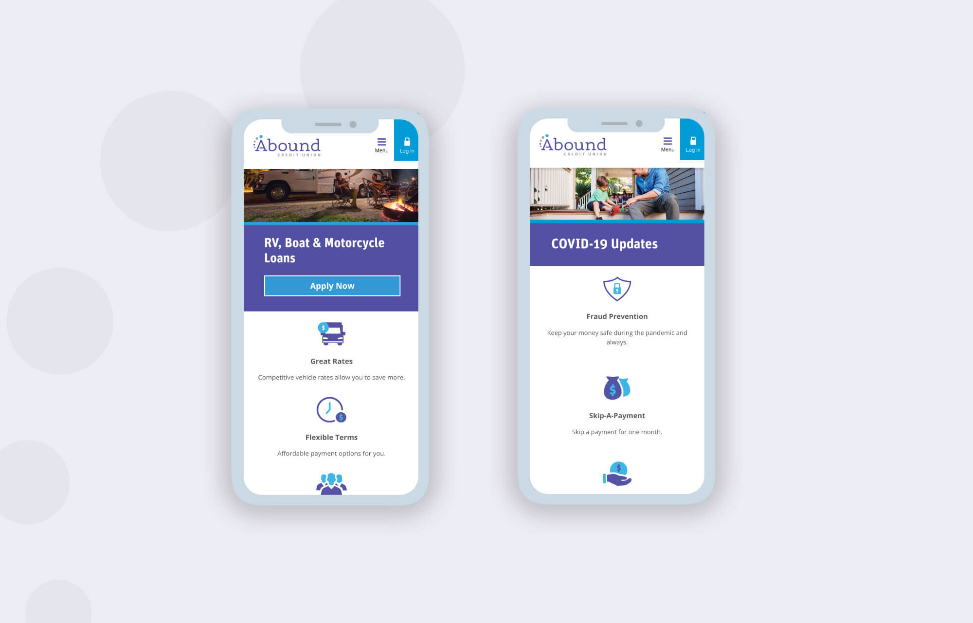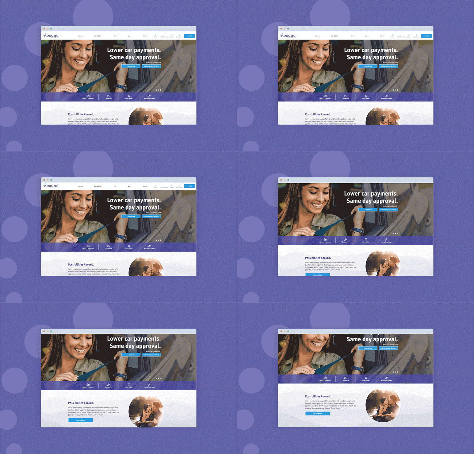
RESPONSIVE WEB DESIGN: A new and improved responsive site for the largest Credit Union in Kentucky.
Web Design, Content Strategy
My Role:
Web & Graphic Designer
Web hosting and implementation:
ZAG Interactive
Kentico CMS
Other Credits:
Design team at Abound CU
Abound’s old website wasn’t mobile friendly and didn’t reflect the direction the brand and organization wanted to go. The main goals for the site redesign were to create a responsive website, promote brand values, target specific brand personas, improve user experience especially on mobile, and increase opportunity for organic SEO. The new website incorporated Abound’s new brand identity and new custom icons that I created.


I developed out the initial content strategy for each page on the new website to align with who the target persona is for each product & service. The new content strategy, along with the mobile friendly design brought in an increased 15% new users than the year before, an 8% increase in mobile users, and an 8% bounce rate decrease from mobile users.


Before & After
Move the slider to view the difference between the old site on the left and the new site on the right.


