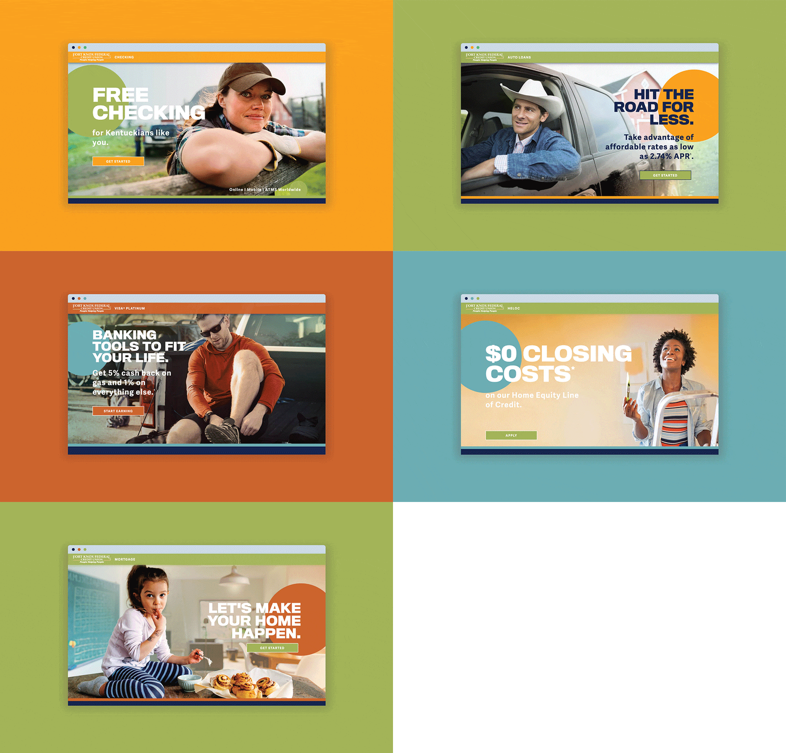
PROMOTIONAL SITES: Streamlining Member Experience (MX) while our new site was being developed.
Responsive Web Design, User Experience, Motion Graphics
My Role:
Web Designer, Developer, Copywriter, Animator
Other Credits:
Alan Smith (Designer)
Strum Agency
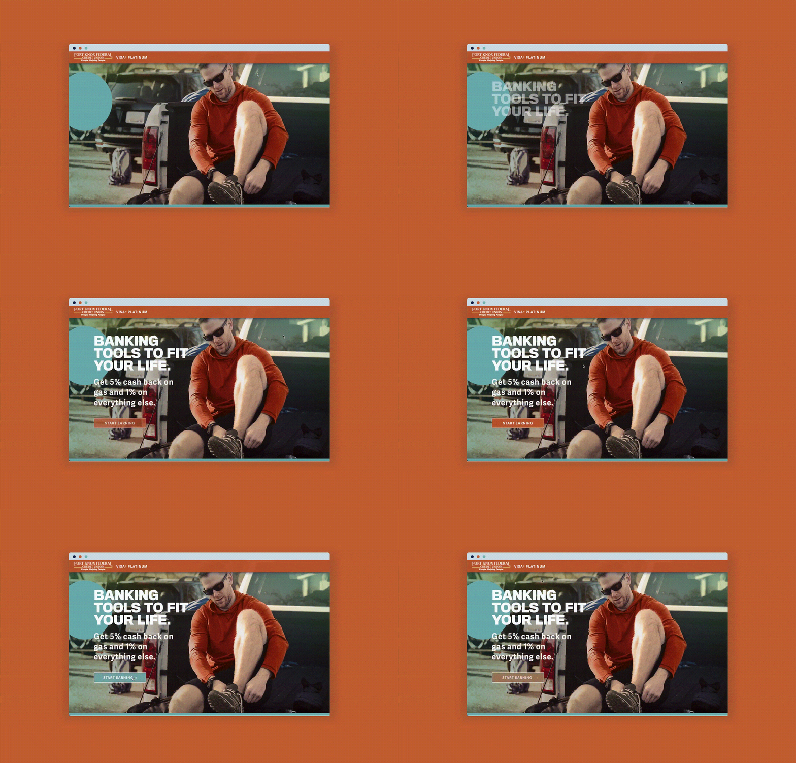
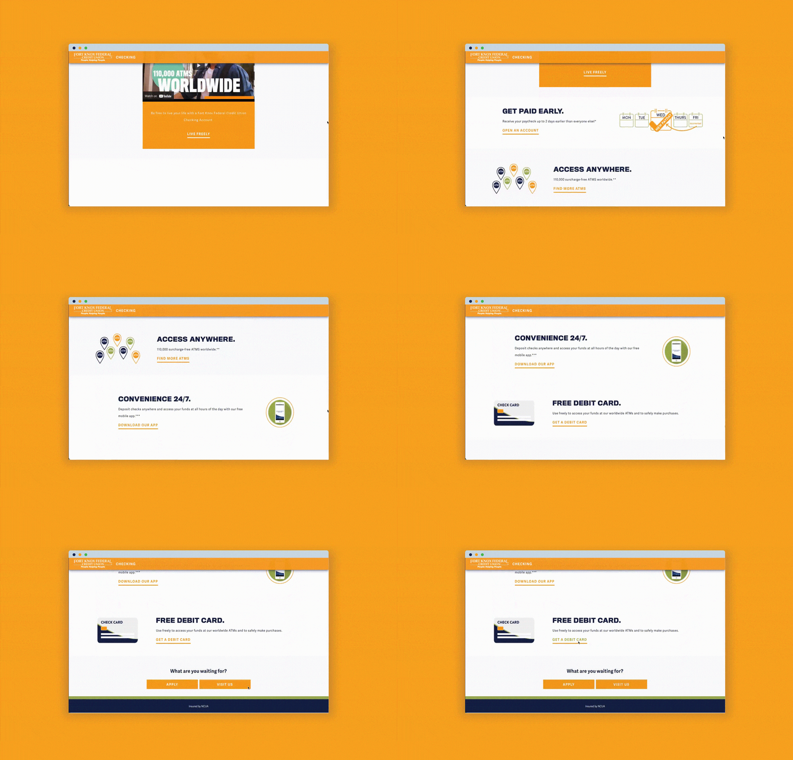
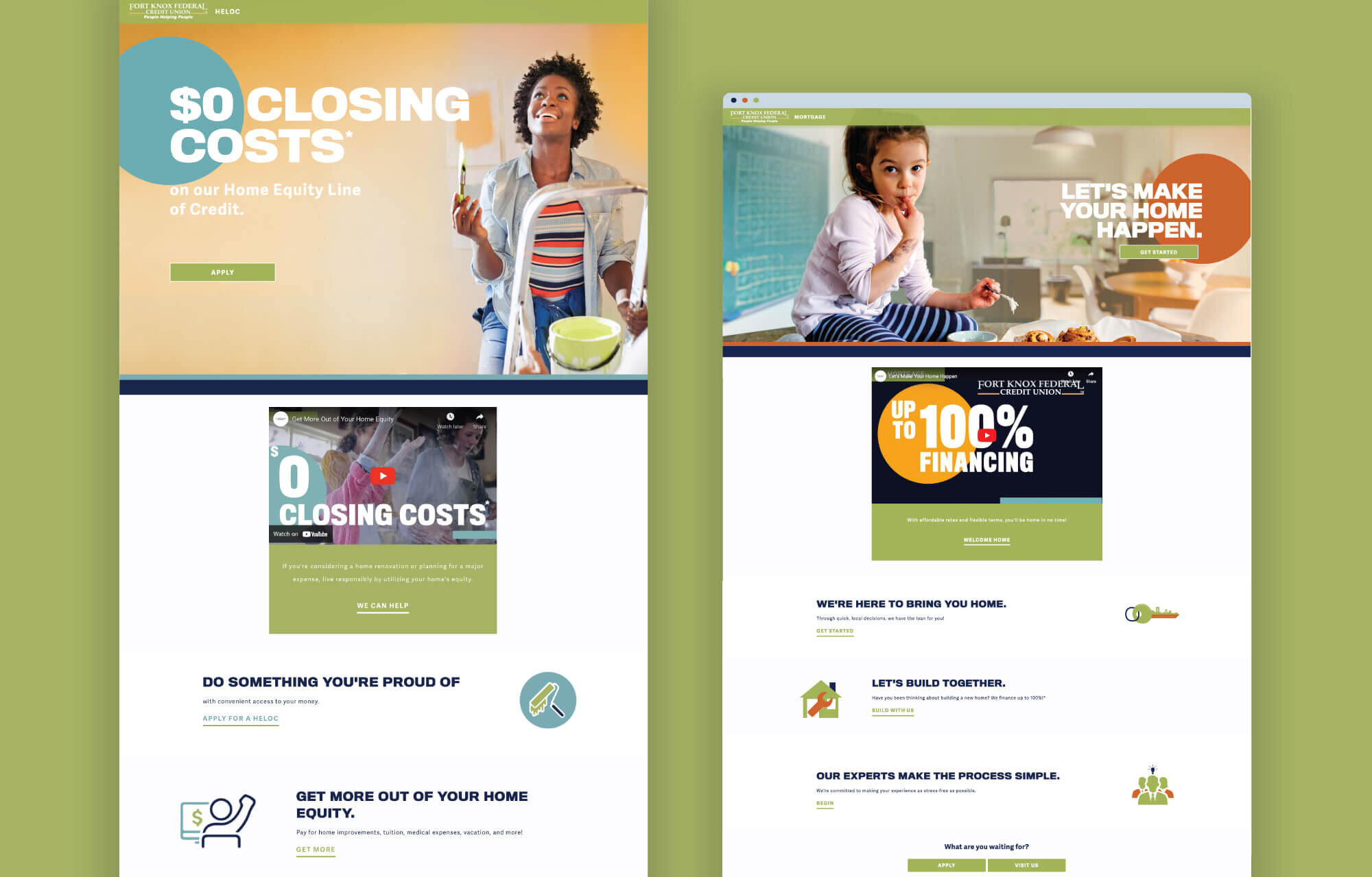
The goal behind these product sites was to push all of our digital and print ads to these pages for a streamlined user experience. These landing pages are clean, modern and responsive with simple CTAs driving action. Each page included a promotional video that was consistent with what was in our digital ads and custom icons that I created for each product.
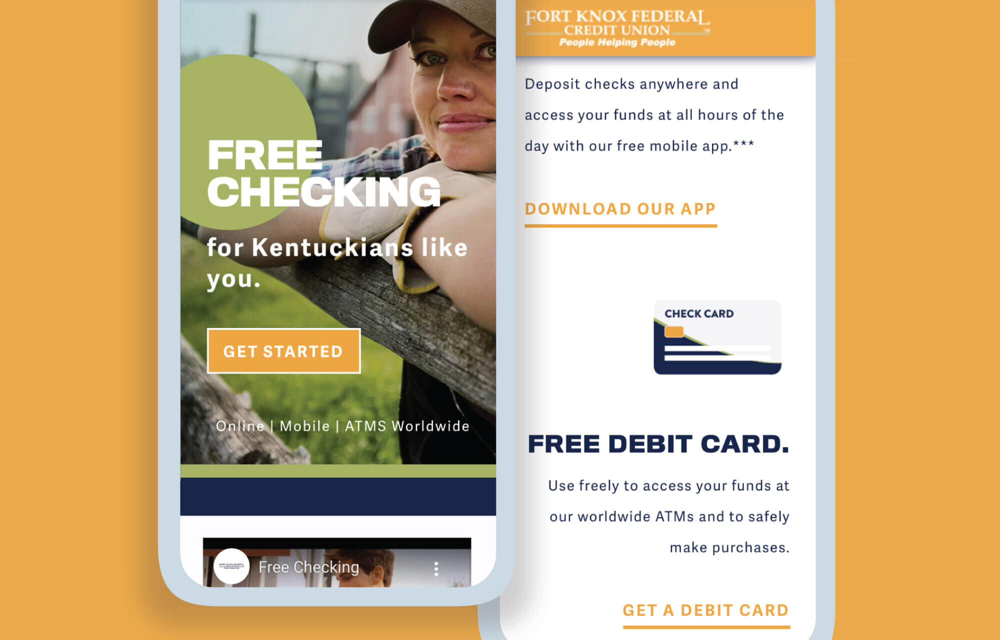

I worked diligently with the other designer to make sure the hero image for each page is responsive. We made sure no words were going over any faces and the text is always readable. The landing pages are different in that the product, color scheme, text and icons are different, but the layout and style are the same.


Home Equity Line of Credit Promotional Video
The idea behind this video is to stay consistent with the brand color scheme, create smooth transitions to keep the viewer interested, and show ways that a Home Equity Line of Credit can improve the viewer’s life.

